The E-Hot Wheels Moped: designing a new interaction paradigm for semi autonomy

This image shows a side by side of the user interface and physical prototype of the vehicle.

Role

Designer

Team

2 Researchers, 2 Product Designers (including me)

Duration

6 weeks (October - November 2023)

The E-Hot Wheels Moped: designing a new interaction paradigm for semi autonomy

Role

Designer

Team

2 Researchers, 2 Product Designers (including me)

Duration

6 weeks (October - November 2023)

SUMMARY

The E-Hot Wheels Moped is a project that I created as part of my Interaction Design course at Carnegie Mellon. In this project, my team and I had the goal of making mopeds more accessible and user friendly for everyone. As this was a collaborative group effort, we divided most stages evenly across the team. My contributions included:

  • Creating detailed wireframes

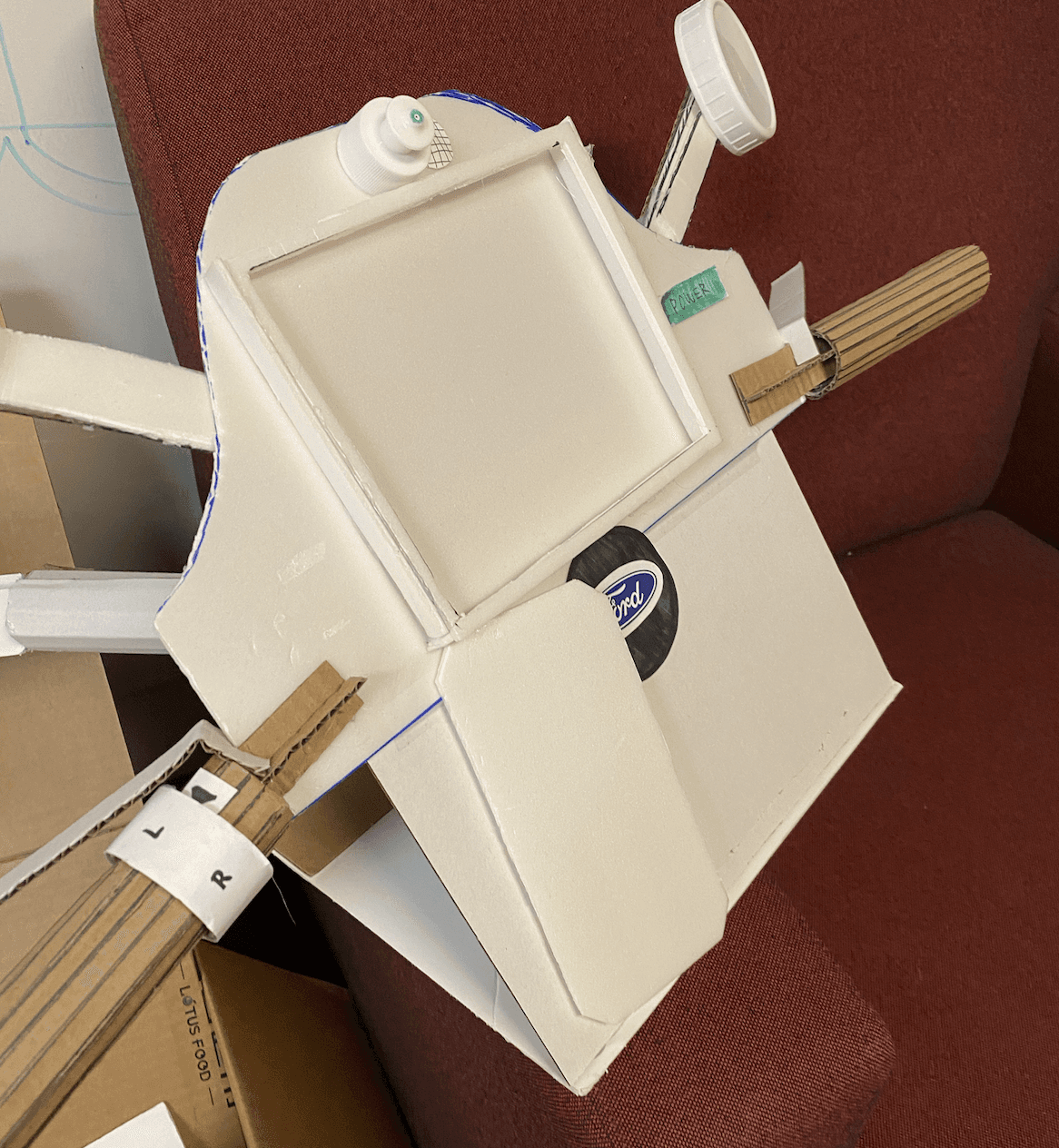
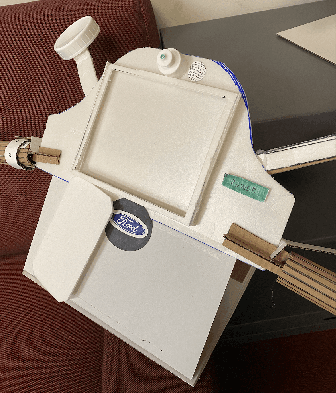
  • Building a physical prototype

  • Crafting high-fidelity interactive prototypes

  • Conducting user test sessions with other students

The E-Hot Wheels Moped is Ford’s newest accessible vehicle innovation.

The E-Hot Wheels Moped is Ford’s newest accessible vehicle innovation.

This image shows the user interface of the vehicle.

Improved road safety

E-Hot Wheels reduces the number of accidents by integrating semi-autonomous technology that assists riders in avoiding hazards and making safe driving decisions.

Accessible

Accessible to everyone by including capabilities that accommodate individuals with cognitive and physical disabilities.

Enjoyable

A moped that’s not only safe and accessible but also enjoyable to ride, creating a stress-free commute.

OVERVIEW

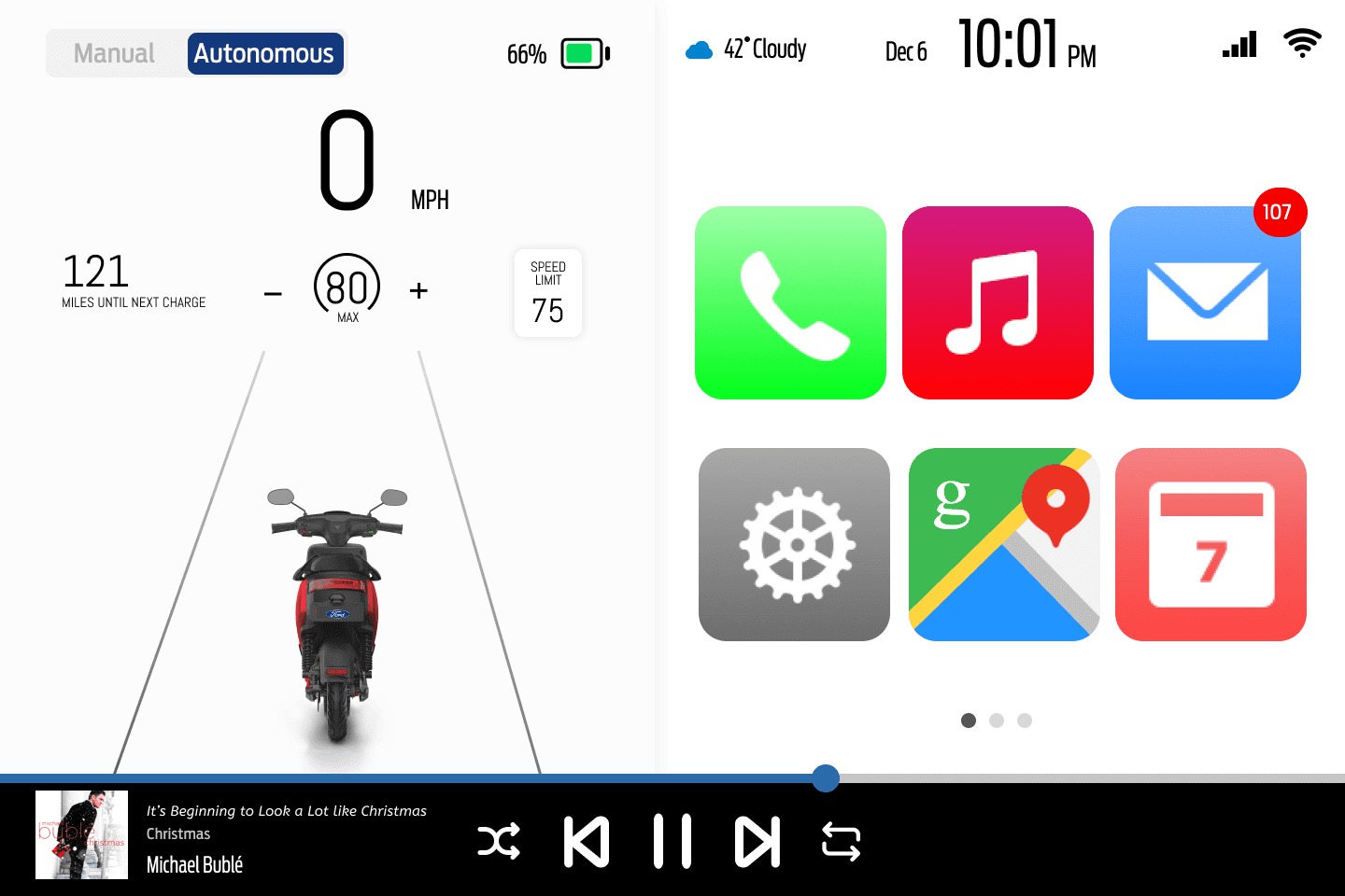
Ford is releasing a new semi-autonomous moped designed to help reduce the number of accidents on the road, making them more accessible for those with cognitive and physical disabilities. Ford came to us with the task of designing new controls and interaction paradigms for the moped.

UNDERSTANDING THE PROBLEM SPACE

To understand the problem space and the potential pain points that already existed surrounding mopeds, we conducted a guerrilla research session through user interviews and user feedback.

“I don’t know how to adapt my moped for use in different regions.”

“I really enjoy the flexibility that mopeds offer.”

“I was scared when driving a moped for the first time, but I was able to get comfortable after some time”

“I use a moped to go short distances, such as around the neighborhood, so I don’t know how to use them to adjust to different road conditions.”

Through this process, we identified key issues with mopeds that informed our design decisions. Here are the insights we uncovered about moped riders' needs and desires:

Inconsistent road regulations

Road regulations vary significantly across states and countries. This inconsistency can confuse users and create barriers, making mopeds less accessible for riders from diverse regions.

Limited suitability for all roads

While mopeds perform well on shorter trips and simpler routes, they are not the preferred choice for longer distances or more complex journeys. Their design and capabilities often restrict their versatility with certain road types.

Learning curve for new drivers

Driving a moped can feel intimidating to new users. However with time and practice, riders can become more comfortable navigating them.

Information overload on small digital interfaces

Small digital interfaces on mopeds limits the amount of visible information. However, these interfaces must still provide essential details like current speed, battery levels, and navigation to ensure driver safety.

TURNING RESEARCH INSIGHTS INTO DESIGN OPPORTUNITIES

With a clear understanding of the main challenges faced by moped riders, we shifted our focus to the design process. Our goal was to generate innovative solutions that addressed these challenges, outside of traditional controls already available in standard vehicles. Here's a list of design opportunities we developed:

With a clear understanding of the main challenges faced by moped riders, we shifted our focus to the design process.

Our goal was to generate innovative solutions that addressed these challenges, outside of traditional controls already available in standard vehicles. Here's a list of design opportunities we developed:

IDEATION

VISION BOARDS AND SKETCHES

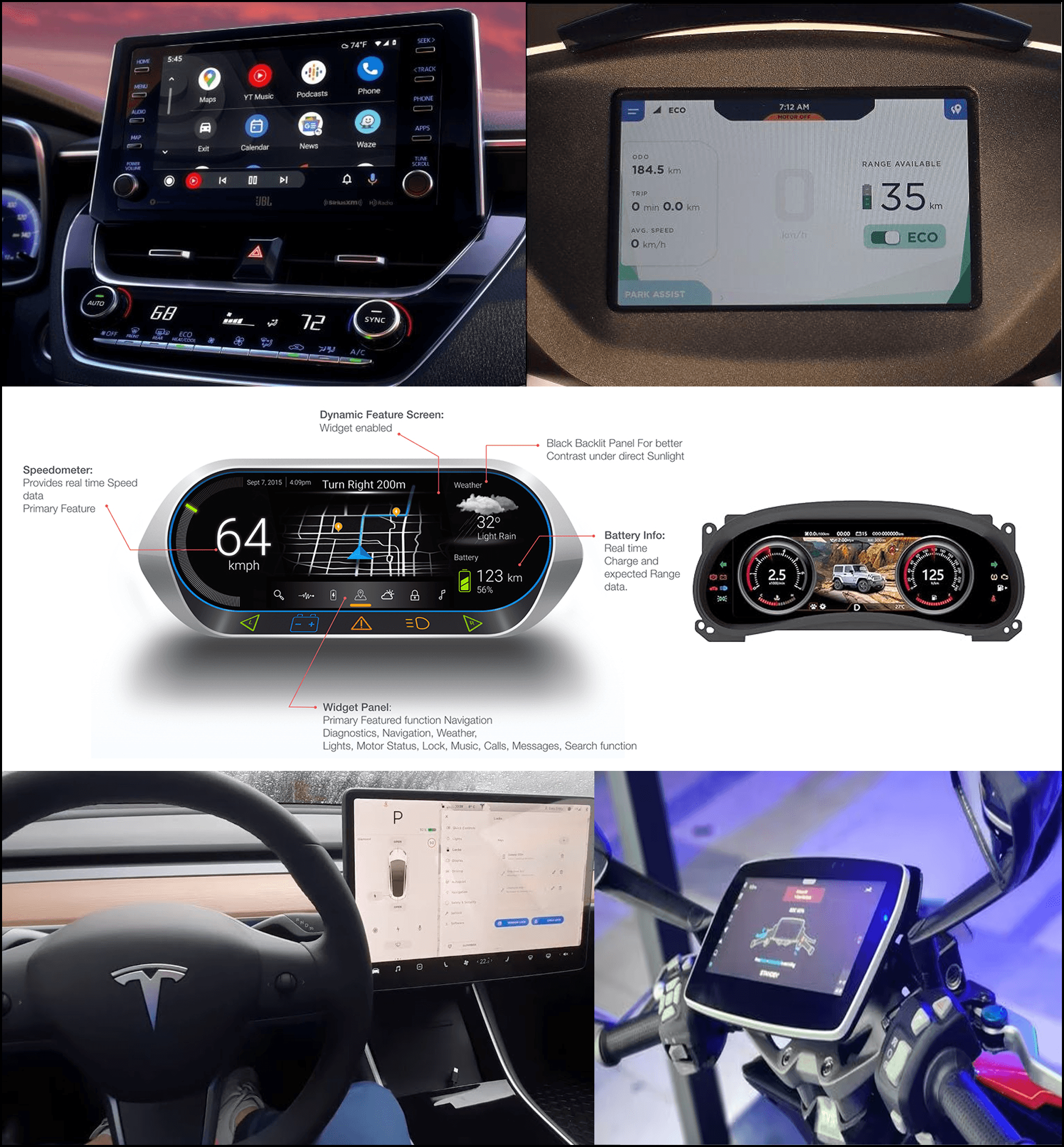
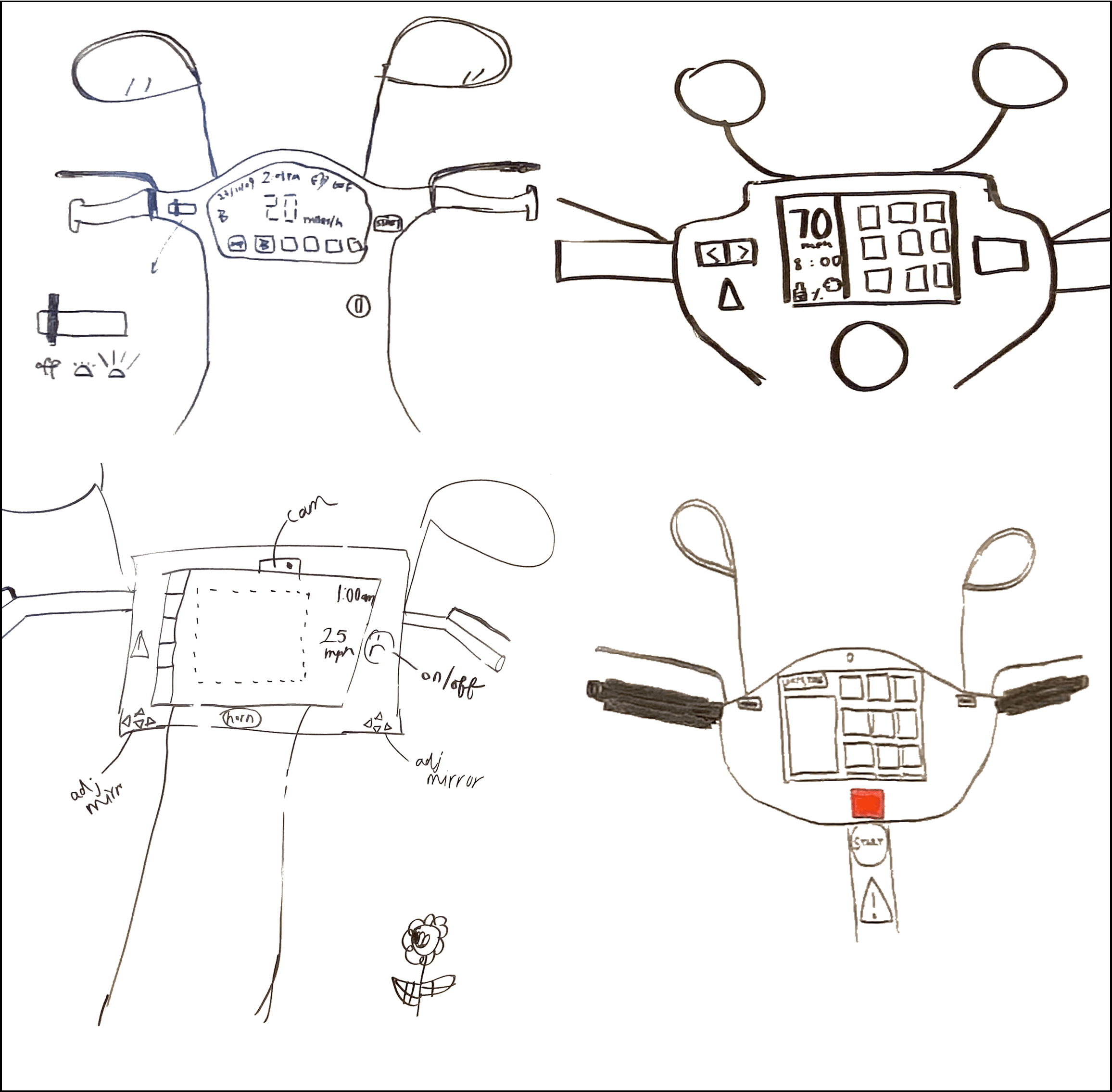
To kick off the ideation phase, I gathered inspiration from existing vehicle screens, and analyzed design patterns from cars, scooters, and mopeds to understand what worked well in real-world contexts. Using these insights, I created initial sketches to explore how our designs would be integrated into the moped interface.

This image shows a collection of interfaces of autonomous vehicles.

Dashboard design inspiration

This image shows various sketches of the physical prototype.

Sketching out the physical moped prototype

This image shows a collection of interfaces of autonomous vehicles.

Dashboard design inspiration

This image shows various sketches of the physical prototype.

Sketching out the physical moped prototype

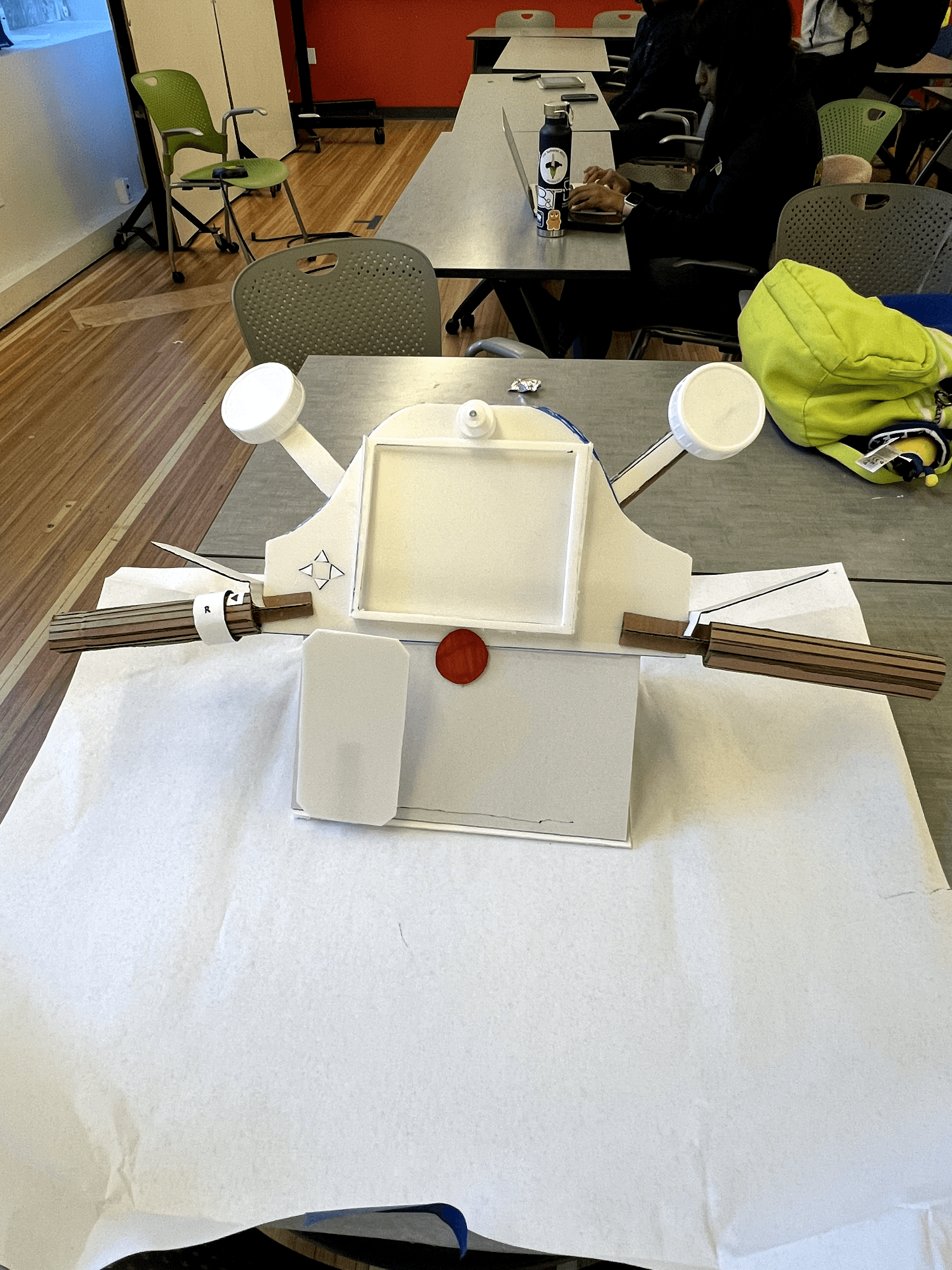
LOW FIDELITY PAPER AND PHYSICAL PROTOTYPES

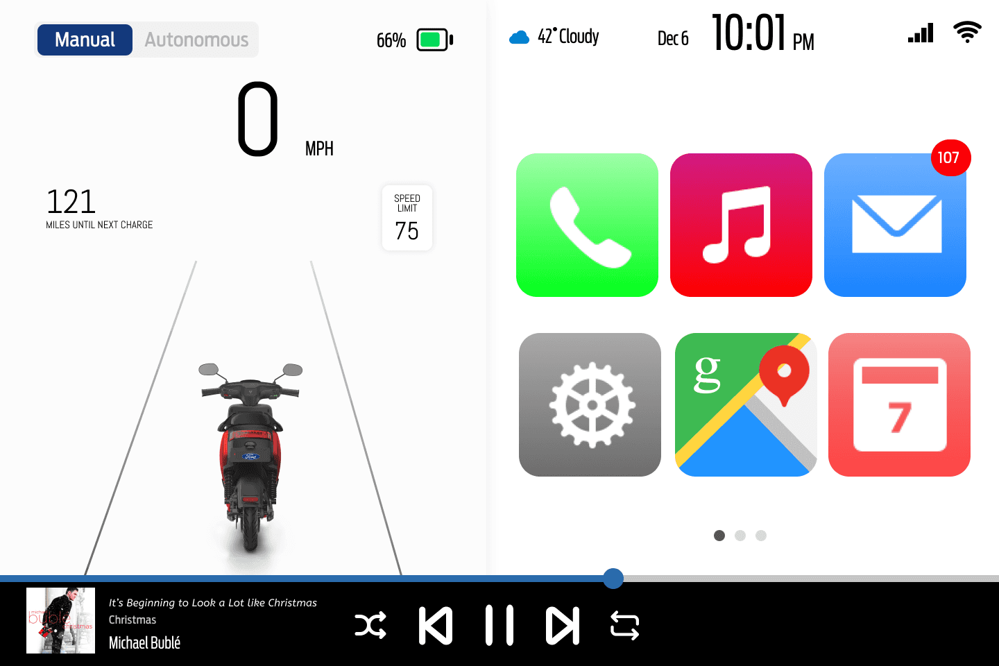
First, I sketched out ideas onto a tablet-sized piece of paper and used a ‘Wizard of Oz’ technique to demonstrate the interaction design of our team's prototype.

This image shows various sketches of the interface.

TESTING

We tested our low-fidelity and physical prototype with 10 individuals of varying moped knowledge and skill levels, using the same user group with whom we conducted initial user research. Test participants were instructed to drive the vehicle, and given a scenario to lead them to their next destination. As we conducted the user test, we asked participants to make sense of what they were seeing and what they might expect to do next.

This image shows a working design of the physical prototype.

Design Feedback

These are the issues we discovered from user testing, alongside positive feedback, helping us track aspects that confused users and needed improvement.

  • Confusing information architecture and lack of wayfinding

  • Unclear visual hierarchy

  • Users struggled to identify interactive elements

Design Iteration

I made changes based on the user feedback and then reached out for additional feedback from professors and more users. My team and I created a high-fidelity version of the moped screen that featured more white space, creating a cleaner layout, and better hierarchy, with clearer visual distinctions between elements.

As seen in the video above, we tested our low fidelity and physical prototype with about 10 individuals with varying moped knowledge and skill levels. Test participants were instructed to drive the vehicle, and given a scenario to lead them to their next destination. As we conducted the user test, we asked participants to make sense of what they were seeing and what they might expect to do next.

User Interface Design Changes

This image shows a screenshot from the vehicle's user interface.
  1. More intuitive navigation

We were so focused on designing the features and moving forward that user testing revealed a crucial step we had missed: moving backwards. Users are now able to return back to the home screen after completing their ride by swiping up on the screen.

This image shows a screenshot from the vehicle's user interface.
  1. Clear interactivity

Originally, the prototype did not have a clear distinction between interactive and uninteractive buttons, making it difficult for the user to have the autonomy to switch between different driving modes. I created a slider to easily toggle between manual and autonomous mode.

This image shows a screenshot from the vehicle's user interface.
  1. Clear visuals

  1. Clear Visuals

The content and language used on the original version made it confusing to understand the distinctions between different numbers on the dashboard. So, we changed the positioning of the current speed and clearly showed the maximum speed the vehicle can reach. 

We also Incorporated speed limit data to allow users to have a metric by which to set the maximum speed against.

Physical Prototype Design Changes

This image shows another angle of the physical prototype.

Testing revealed many overlooked design aspects. The original version of the prototype had users using the horn as the power button, so we separated these buttons and added the Ford logo to the horn button, mimicking patterns in vehicles that have their logos on the steering wheel.

This image shows a physical prototype of the vehicle.

Reflection

✧ I developed impromptu thinking while conducting in-person user tests

In previous roles, I moderated user tests by setting up test protocols and reviewing how people interacted with my designs virtually, but here I gained valuable experience with testing these prototypes and getting real-time feedback. This tested my ability for on-the-spot thinking.

✧ I learned how to leverage testing feedback to our advantage

✧ Learned how to leverage testing feedback to our advantage

We went through many rounds of user testing, with people familiar and unfamiliar with the project, people with varying levels of riding experience, and knowledge about UX and HCI. Each round of testing provided a unique situation in which I got to test my skills with conducting user tests. This allowed me to get more comfortable with explaining our project and context to all kinds of audiences.

We went through many rounds of user testing, with people familiar and unfamiliar with the project, people with varying levels of riding experience, and knowledge about UX and HCI. Each round of testing provided a unique situation in which I got to test my skills with conducting user tests. This allowed me to get more comfortable with explaining our project and context to all kinds of audiences.

The E-Hot Wheels Moped is Ford’s newest accessible vehicle innovation.

This image shows the user interface of the vehicle.

Improved road safety

E-Hot Wheels reduces the number of accidents by integrating semi-autonomous technology that assists riders in avoiding hazards and making safe driving decisions.

Accessible

Accessible to everyone by including capabilities that accommodate individuals with cognitive and physical disabilities.

Enjoyable

A moped that’s not only safe and accessible but also enjoyable to ride, creating a stress-free commute.

UNDERSTANDING THE PROBLEM SPACE

We started out with the people we were designing for. To understand the problem space and the potential pain points that already existed surrounding mopeds, we conducted a guerrilla research session through user interviews and user feedback.

“I really enjoy the flexibility that mopeds offer.”

“I was initially scared when driving a moped for the first time, but I was able to get comfortable after some time.”

“I use a moped to go short distances, so I don’t know how to adjust to different road conditions.”

“I don’t know how to adapt my moped for use in different regions.”

TESTING

We tested our low fidelity and physical prototype with about 10 individuals with varying moped knowledge and skill levels. Test participants were instructed to drive the vehicle, and given a scenario to lead them to their next destination. As we conducted the user test, we asked participants to make sense of what they were seeing and what they might expect to do next.

This image shows a working design of the physical prototype.

Design Feedback

These are the issues we discovered from user testing, alongside positive feedback, helping us track aspects that confused users and needed improvement.

  • Confusing information architecture and lack of wayfinding

  • Unclear visual hierarchy

  • Users struggled to identify interactive elements

Design Iteration

As seen in the video above, we tested our low fidelity and physical prototype with about 10 individuals with varying moped knowledge and skill levels. Test participants were instructed to drive the vehicle, and given a scenario to lead them to their next destination. As we conducted the user test, we asked participants to make sense of what they were seeing and what they might expect to do next.

  1. More intuitive navigation

We were so focused on designing the features and moving forward that user testing revealed a crucial step we had missed: moving backwards. Users are now able to return back to the home screen after completing their ride by swiping up on the screen.

This image shows a screenshot from the vehicle's user interface.

User Interface Design Changes

This image shows a screenshot from the vehicle's user interface.
  1. Clear interactivity

Originally, the prototype did not have a clear distinction between interactive and uninteractive buttons, making it difficult for the user to have the autonomy to switch between different driving modes. I created a slider to easily toggle between manual and autonomous mode.

  1. Clear Visuals

The content and language used on the original version made it confusing to understand the distinctions between different numbers on the dashboard. So, we changed the positioning of the current speed and clearly showed the maximum speed the vehicle can reach. 

We also Incorporated speed limit data to allow users to have a metric by which to set the maximum speed against.

Physical Prototype Design Changes

This image shows another angle of the physical prototype.

Testing revealed many overlooked design aspects. The original version of the prototype had users using the horn as the power button, so we separated these buttons and added the Ford logo to the horn button, mimicking patterns in vehicles that have their logos on the steering wheel.