What is Account Insights?
Account Insights is a reporting tool that allows CareFirst partners to view and evaluate company health insurance data to understand how their employees use health insurance and how much it costs the company.
Account Insights has been through many years of planning and tests, and stands as a redesign of the previous tool called Searchlight. The previous version made it difficult for customers to understand the overall data, what is driving costs, and ways to reduce future healthcare costs. Users often struggled to locate specific data reports, as they would have to navigate through several sections of data, leading to confusion and inefficiency.
My project was to design an intuitive search feature for Account Insights to highlight the most relevant results while also maintaining familiar components.
Product Users
Our target audience is company partners representing CareFirst data

Nancy
HR Director at a mid-sized financial company

Mark
Consultant at a national consulting firm


User Needs
Based on the user journey maps created during the research phase, I identified specific needs to prioritize in my designs.
Understand the effectiveness of current health plans, in order to keep members engaged and maximize their health insurance benefits
Gain access to real-time data to prove that current benefits are a good investment
Keep costs low to maintain the best deal for clients
Features & Functionalities
My team then ideated on potential design solutions in order to resolve the aforementioned user needs. These are the features that we made sure to prioritize in the following design sketches.
Finding reports at the lower level
Access to reports and information in one place
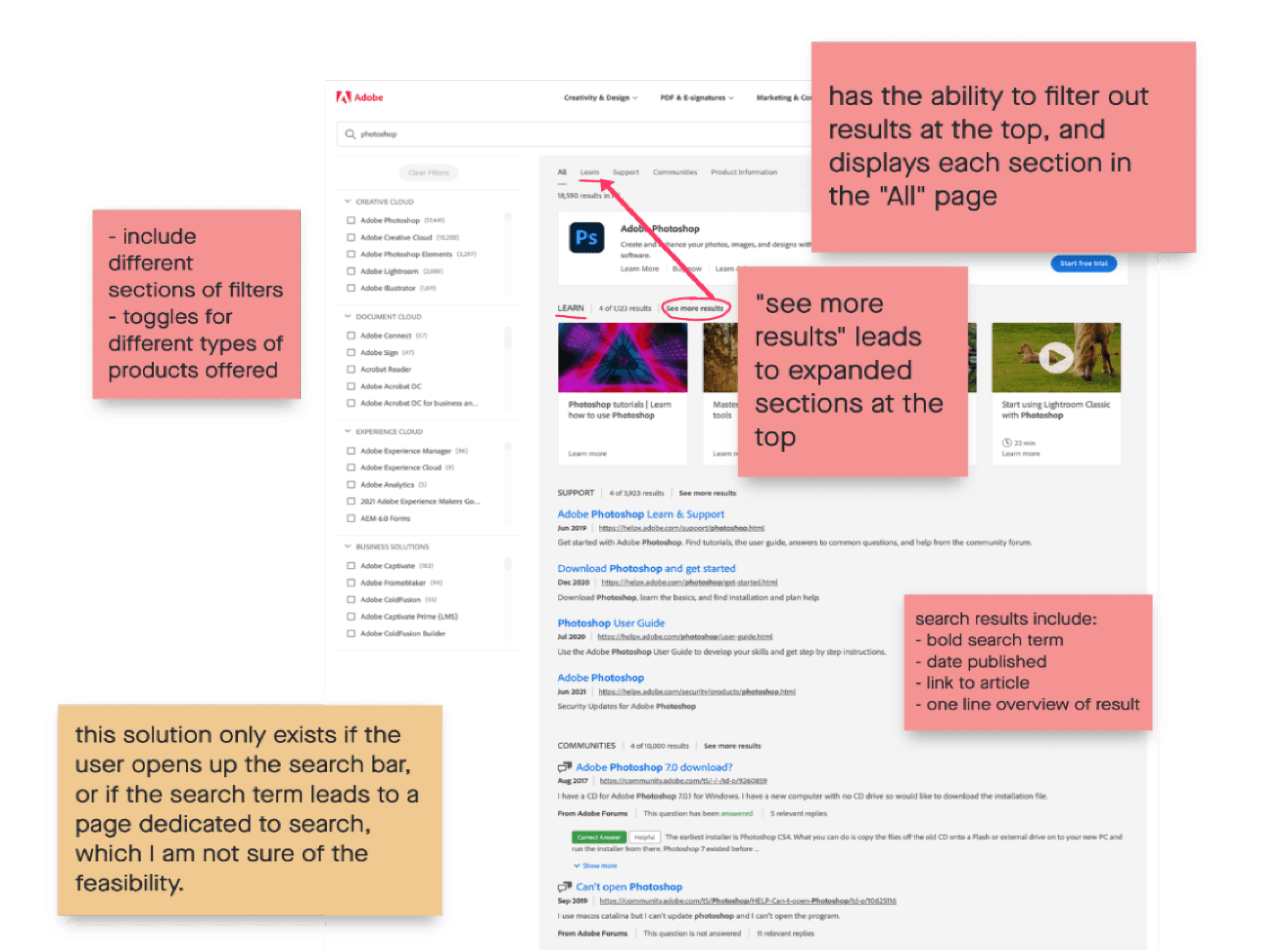
Why I looked into Adobe
Since we were working on a search query as well as a search results page, Adobe’s search bar provided direction about organizing information that can be divided into many different sections.
The screenshot below shows the ability to filter, show more results, expand each results section, and pinpoint exactly what was listed within each result.

Comparative Analysis
To gather design inspiration for the search tool, I wanted to understand how companies that dealt with a variety of product and service offerings organized their information, so I analyzed the following e-commerce sites. When conducting my competitive analysis, I took screenshots of other competitor’s search bars to call out specific features that would be useful to include in our product. I also note of the interactions present in other sites, to mimic the same design patterns in my sketches.
Design
Taking the user research and market analysis into account, I created sketches and wireframes of the following 2 screens: the search dropdown bar and the expanded search results page. These are some elements I designed:
predictive text and voice typing features — making it easier and faster for users to find their report
titles of reports and images of graphs shown in the same order of the report sections shown in the main page of Account Insights, in order to maintain familiarity
Sketches
Wireframes
Similar to many other search features, once the user began typing in a specific keyword, there would be several rows of results that would show the most relevant reports. Then I divided them up into the sections that were established in the previous version, to maintain consistency.
User Testing
I then partnered with a market researcher to user test my designs to determine if they were intuitive and simple to navigate. I wrote a user test script, and created multiple tasks for the users to show their process of searching for a report, to understand how they look for information.
Findings
I learned to work with developers and work around technical limitations.
This was my first time working on a design and handing it off to a developer, and the experience helped me gain valuable insights into the importance of clear communication, understanding technical constraints, and finding creative solutions to bridge the gap between design and implementation. This process enhanced my ability to create designs that are intuitive and technically feasible.
I was able to see my designs being developed in a live environment!
Seeing how my designs went from conceptual ideas to implementation helped me validate my design decisions, and provided valuable insights into design implementation. It was very thrilling to see how my designs created tangible impact!


